Party Mcfly LP

PROJECT:

CLIENT:

INDUSTRY:

Music

SKILLS:

Art Direction, Packaging Design, Illustration

YEAR:

2024

The Rad Max crew reached out to me for their LP project earlier in the year to create a comprehensive packaging project that included cover art, vinyl stamps/insert, and merchandise.

SUMMARY:

A bit of a departure from the more punk influenced work, the band was kind enough to let me take the reigns on the branding and overall art direction for their album cycle.
The Vinyl

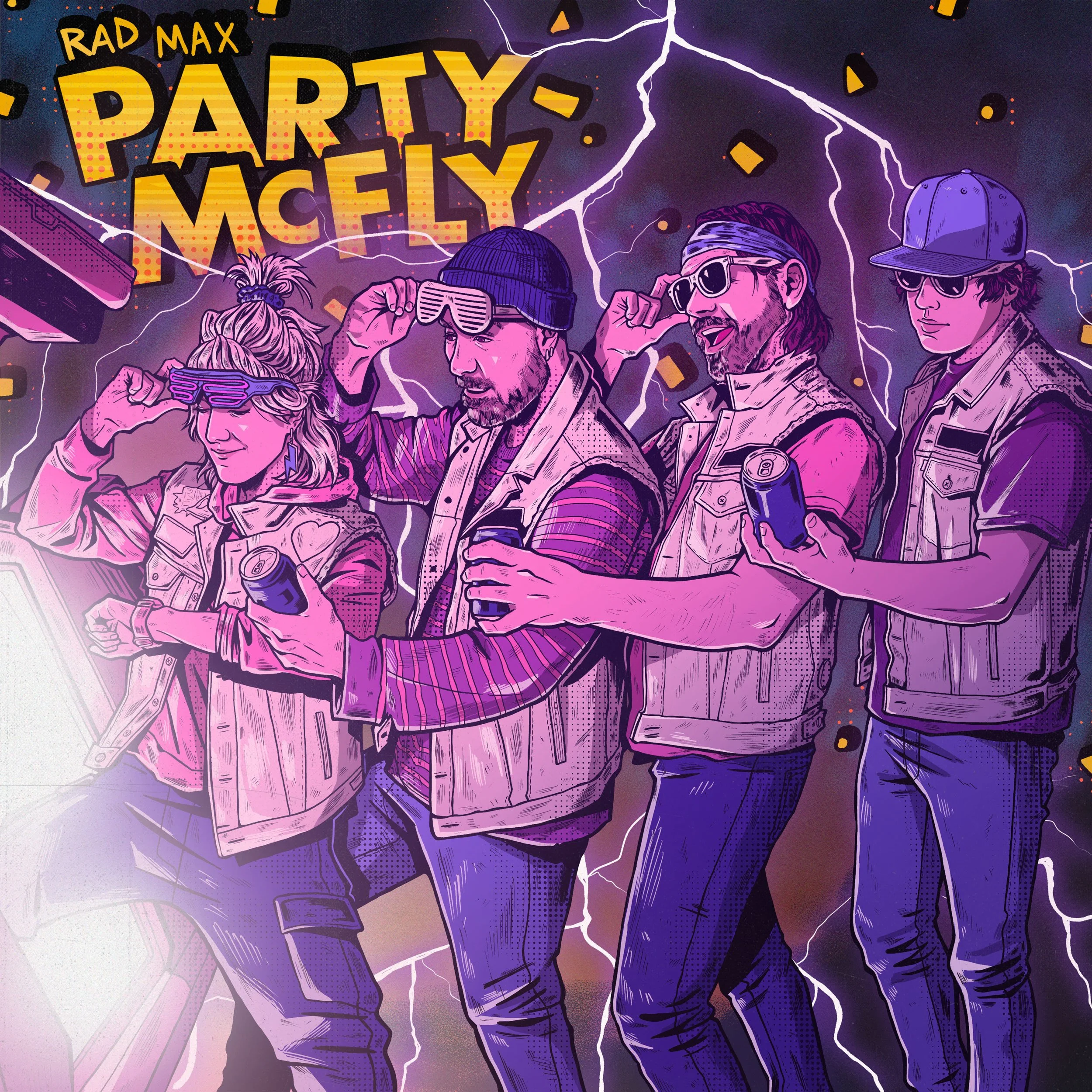
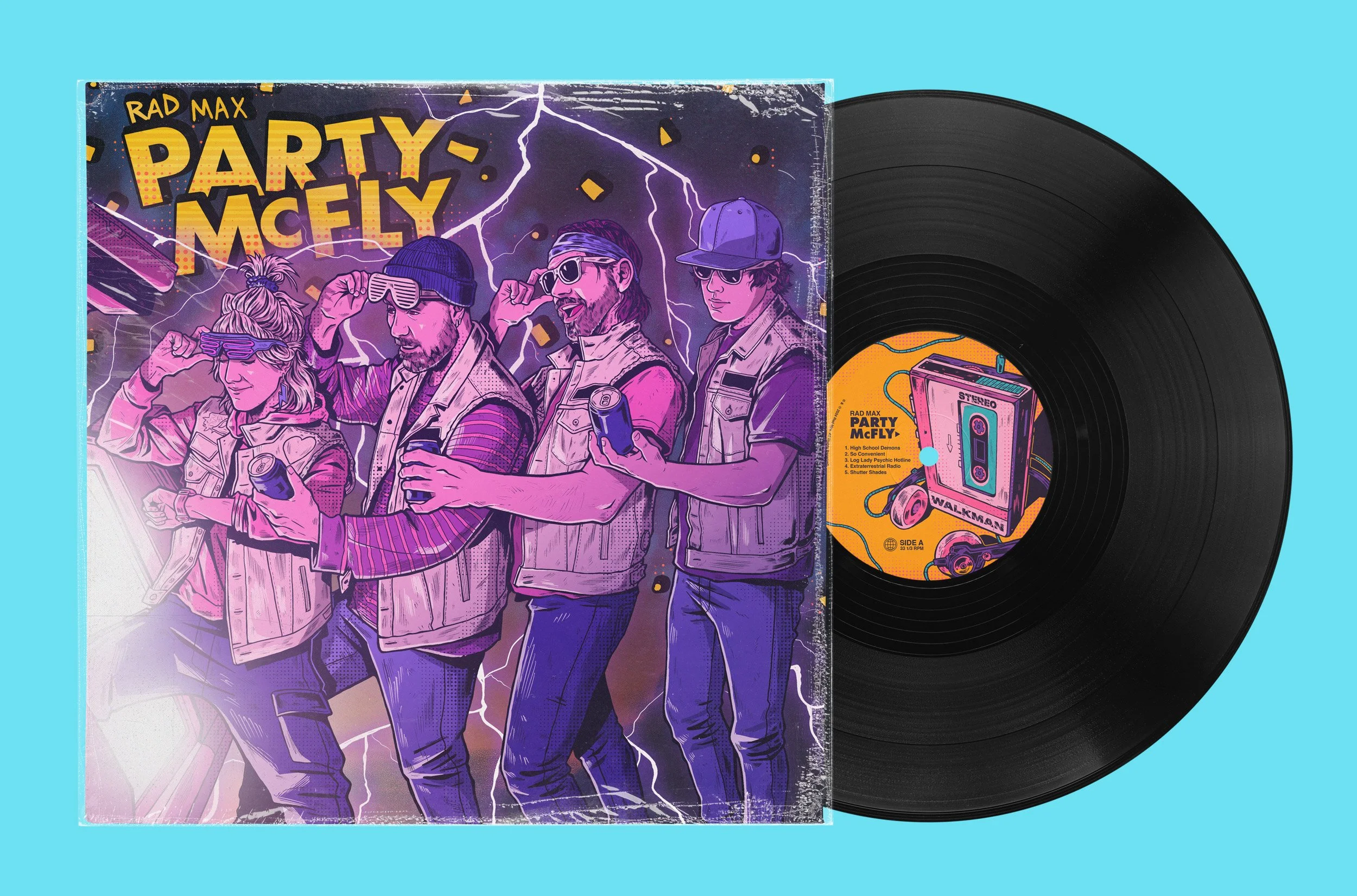
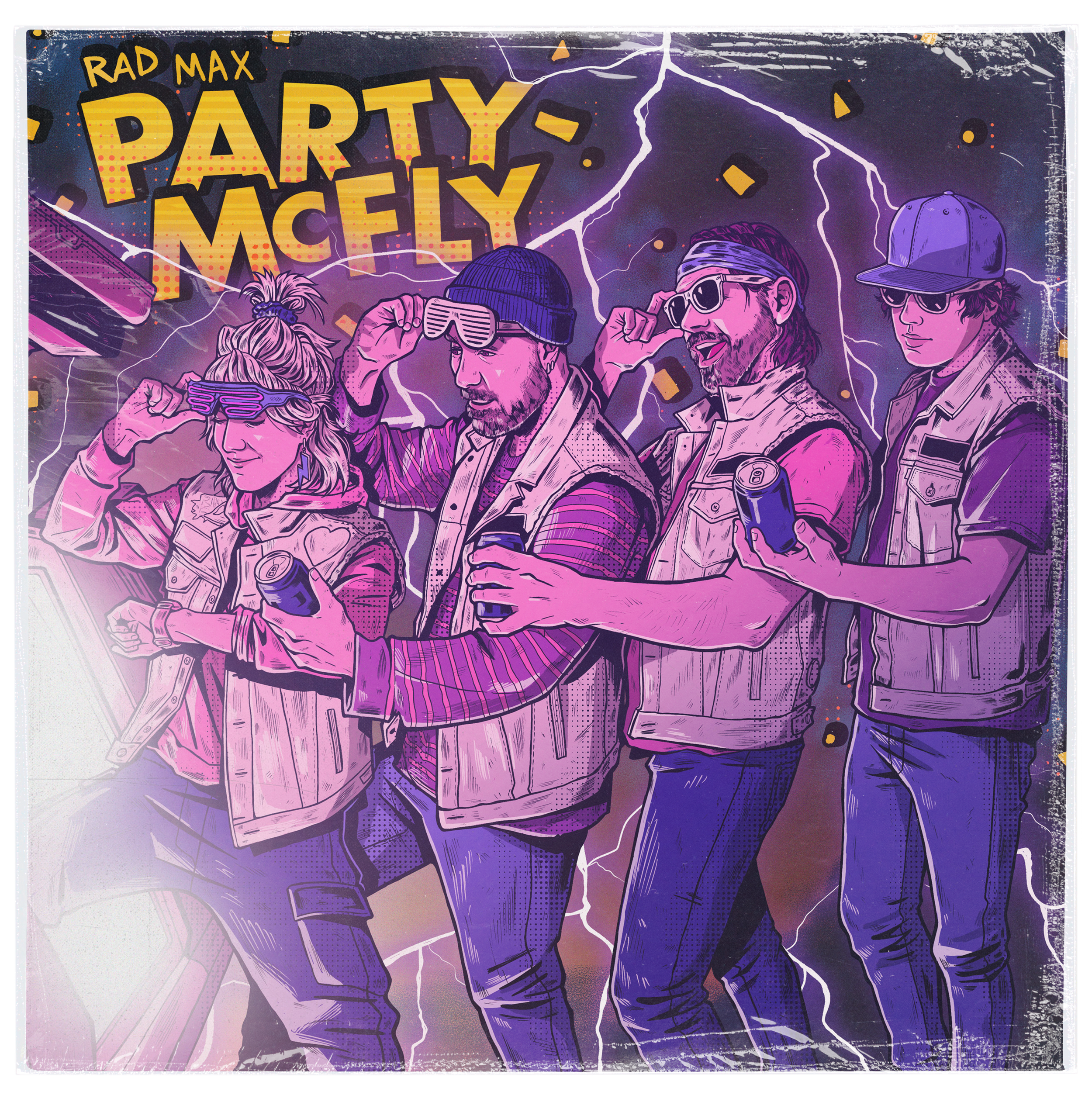
The main focus was of course the album cover, which was the foundation that informed the aesthetics and development of the rest of the deliverables.

The band had an initial concept in mind (an homage to Back to the Future to go in line with their music theming) and I crafted a handful of options which later was refined into the final artwork.

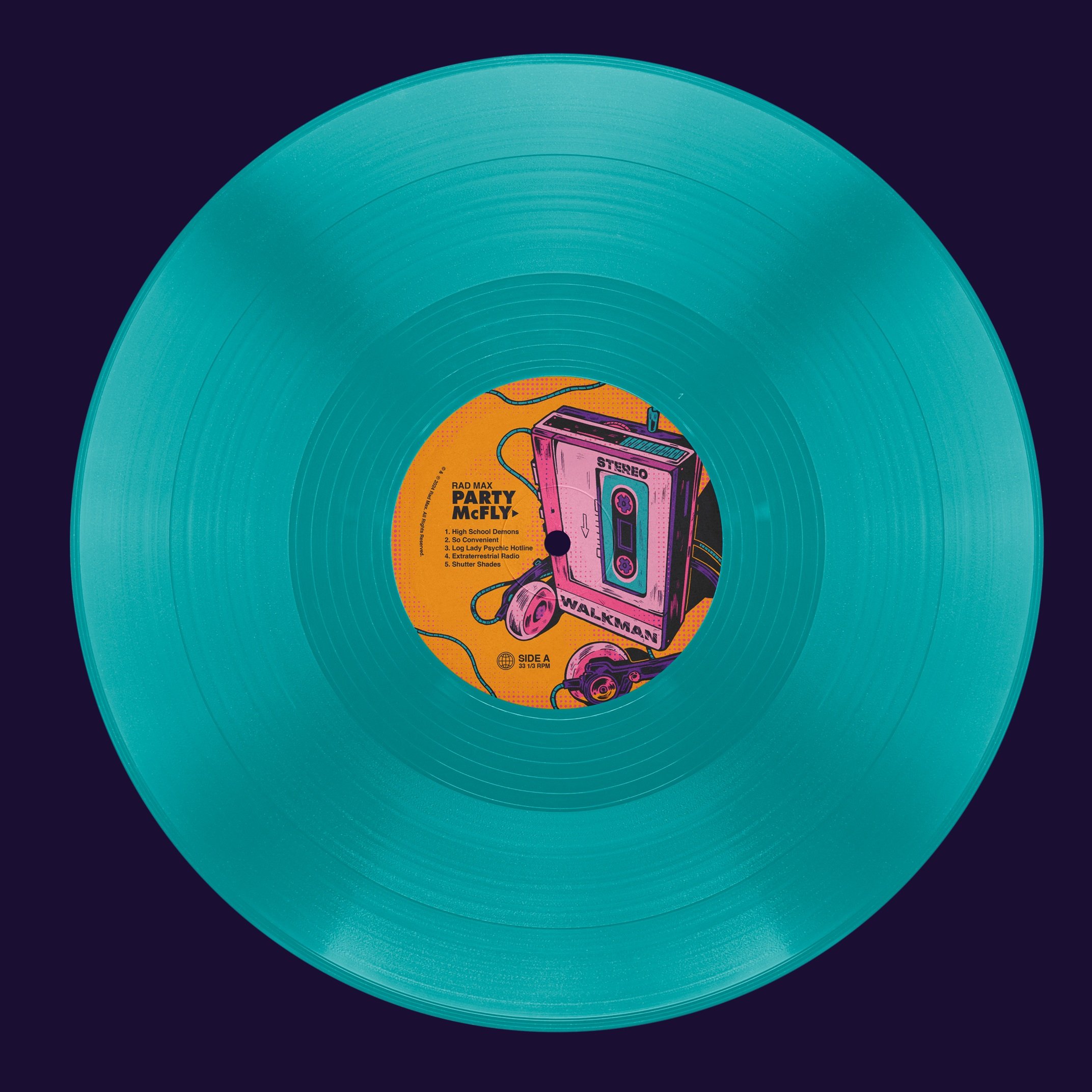
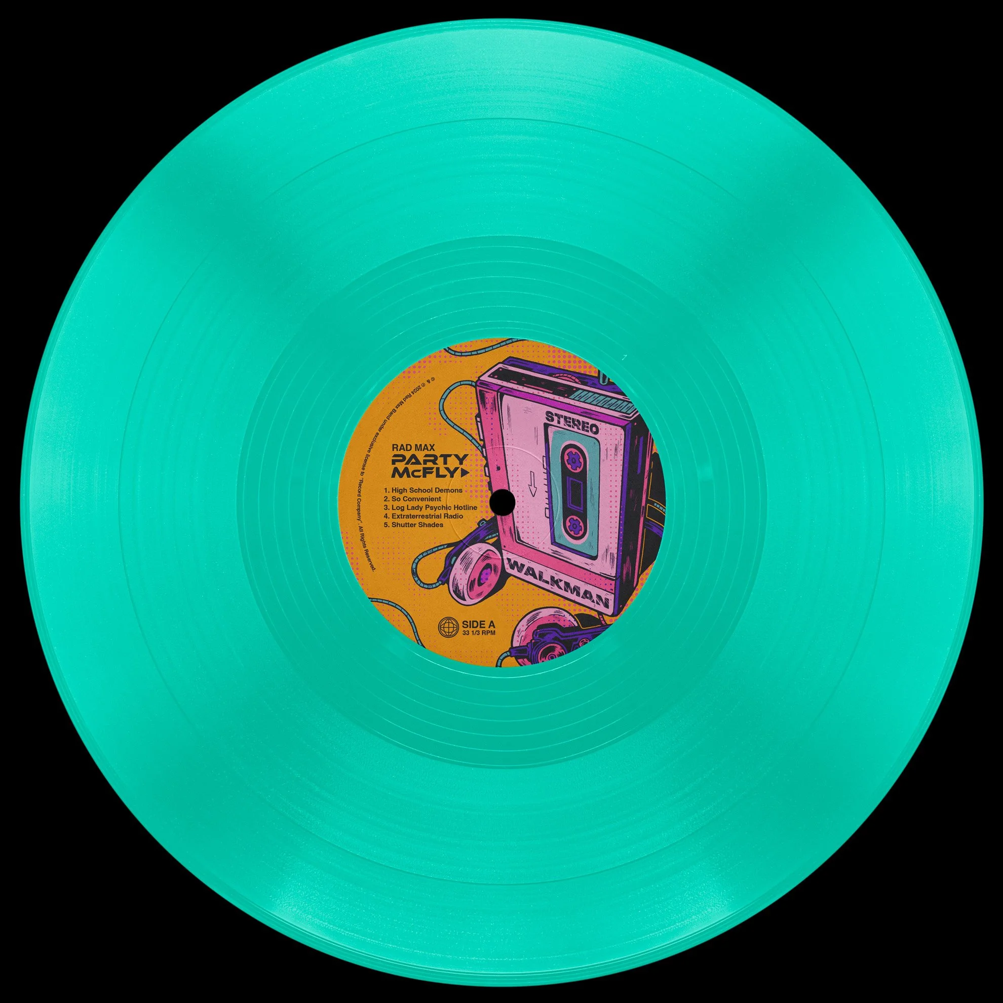
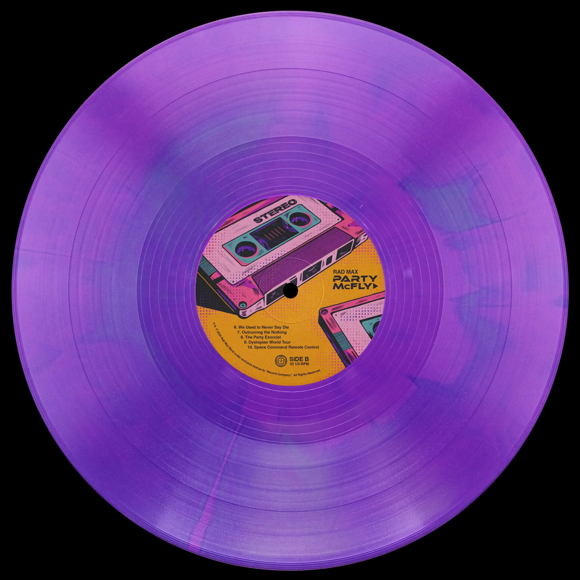
Vinyl - Final artwork with record
Cover Art - Initial Sketch Concepts

Concept 1 - Chosen Direction

Concept 2 - Unused Cover Alternative

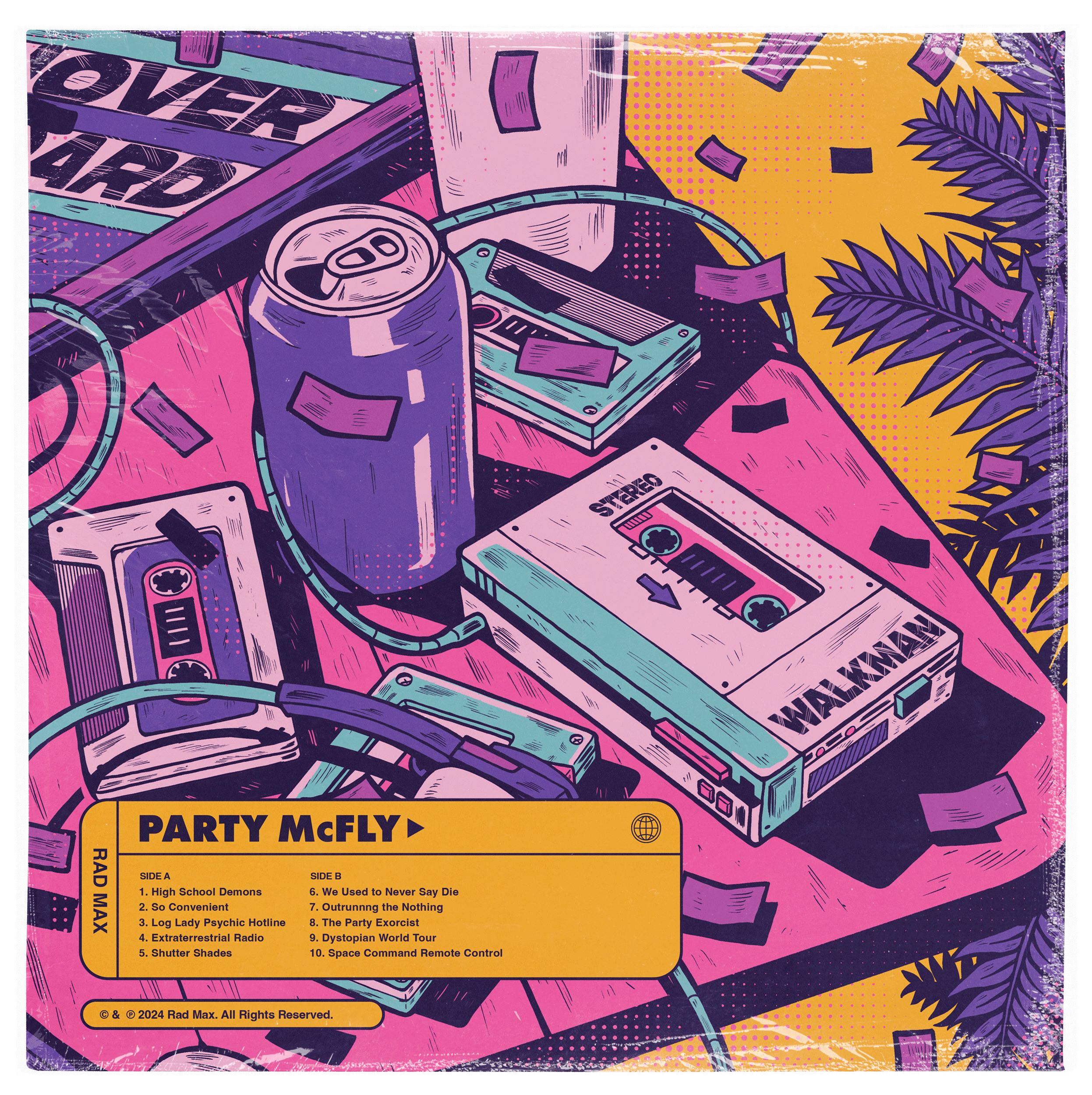
Concept 3 - Reused for Back Cover

Concept 4 - Unused Cover Alternative

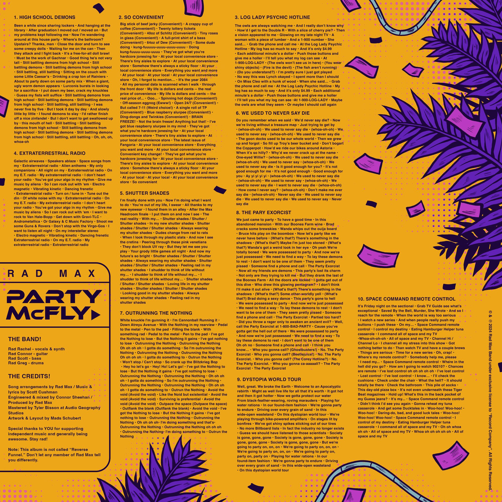
Vinyl - Insert Front

After some ideation and concept sketches, the band decided to move forward with a fully illustrative direction that carried across all deliverables.

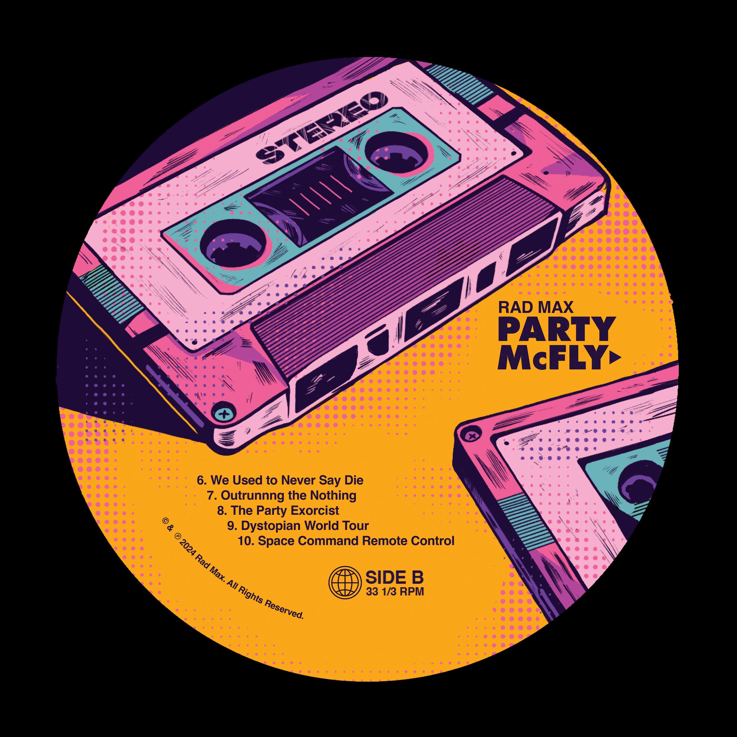
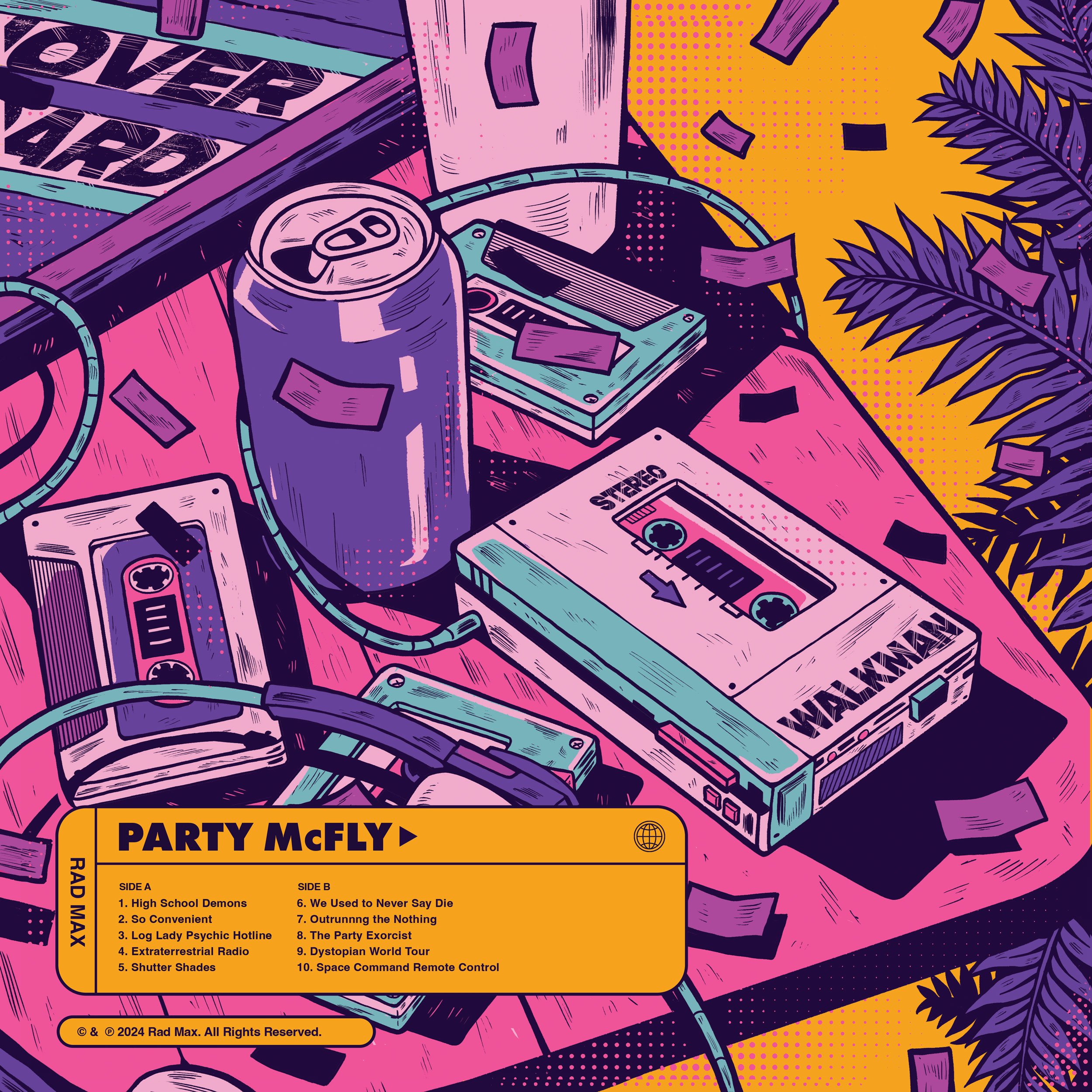
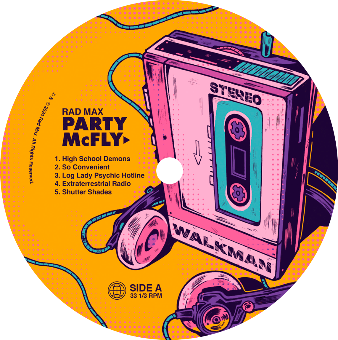
The vinyl stamps, back cover, and insert all utilized 80s iconography and party related aesthetics, incorporating vaporwave influences with a bit of grunge to differentiate the bands look from the competition.

Vinyl Stamp Idea 1 - Unused but informed final direction

Vinyl Stamp Idea 2 - Unused Comp


Vinyl - Front Cover

They wanted to go with a bold and colorful direction that captures the eye and is a departure from the dark and moody tones that is commonly used in 80s vaporwave aesthetics today.

With these, we zeroed in on a minimalist bold color palette that acted as a strict guideline across all deliverables.

Vinyl - Back Cover

The Stickers

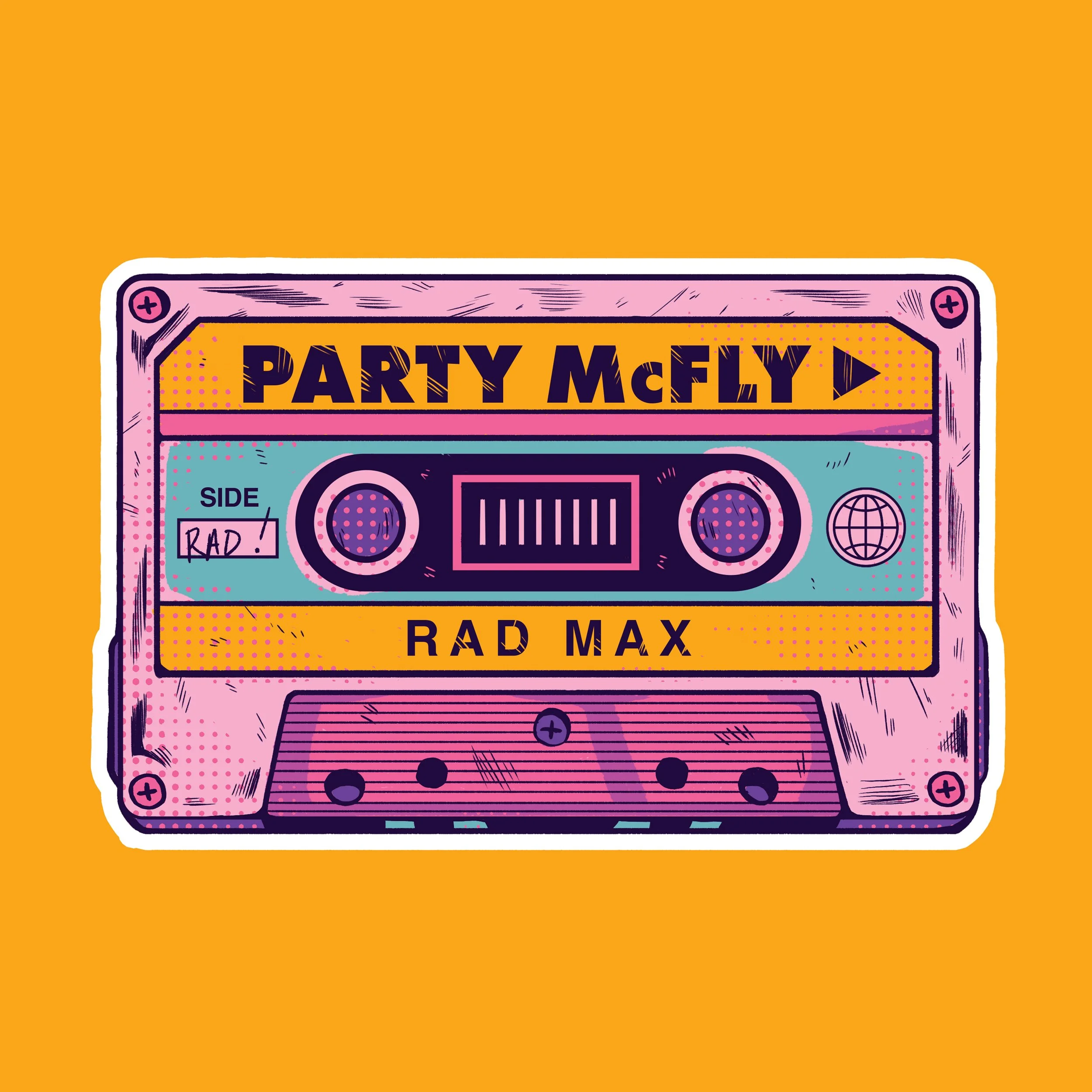
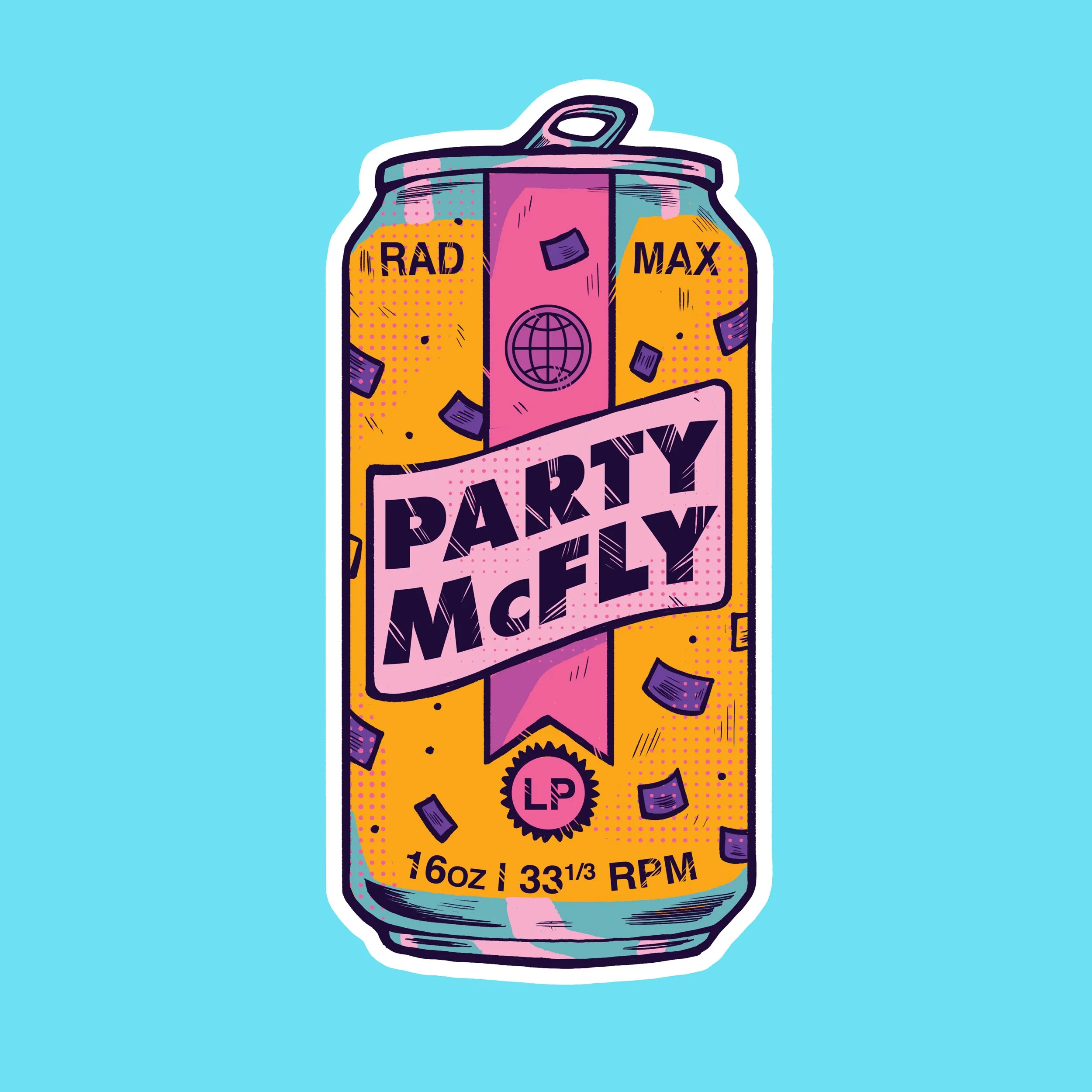
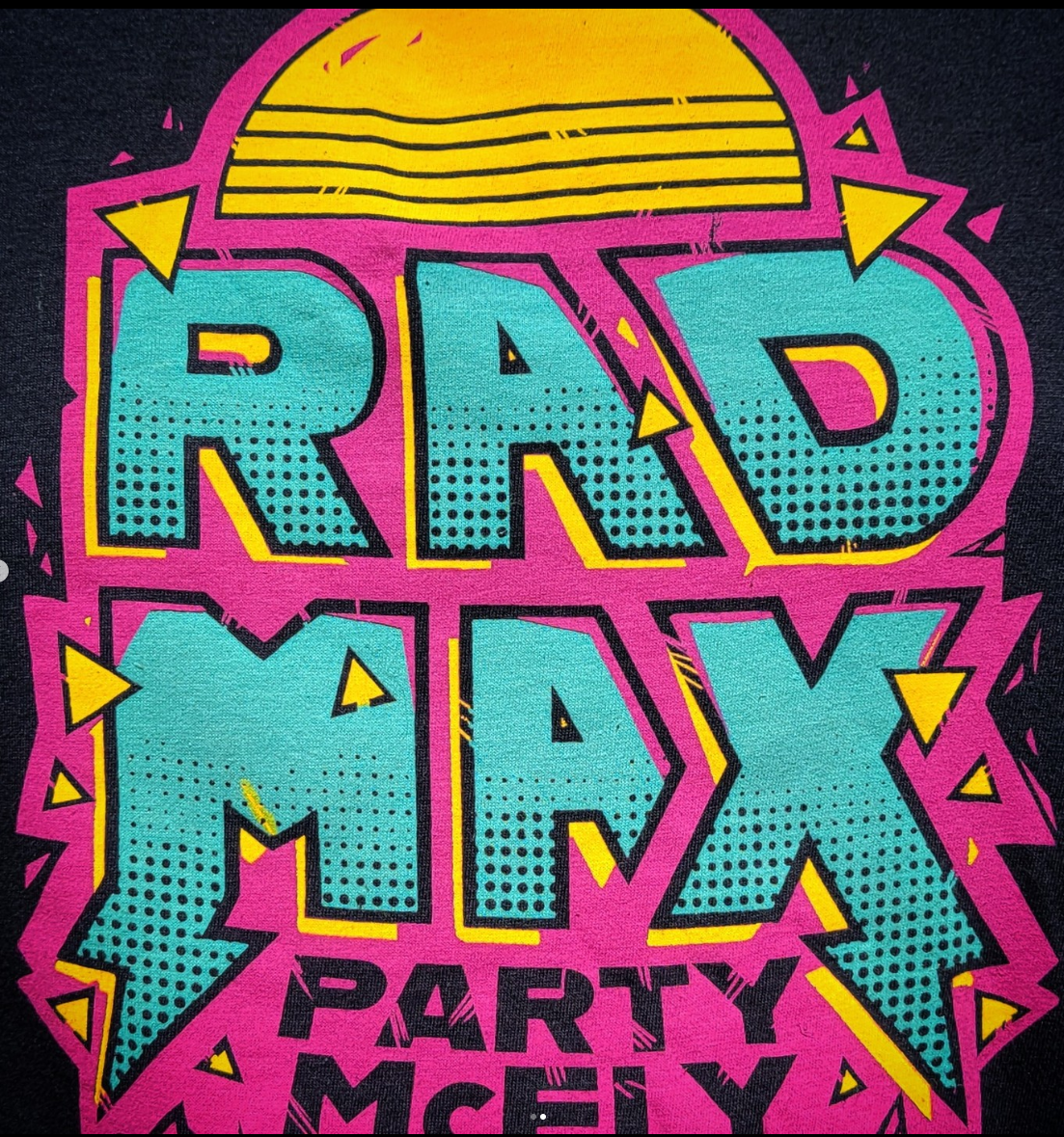
There were a handful of merch items the band wanted to release in conjunction with their album announcement, so we also created some stickers and a t-shirt design to go with the album.

These also kept with the illustrative direction of the project, taking the beer can and cassette tape motif from other deliverables with the minimalist color palette.

Sticker 1 - Cassette Tape

Initial Concept Sketches - 2 & 3 moved into final design phase

Sticker 2 - Beer Can