PROJECT:
SPINE Branding
CLIENT:
SPINE Management
INDUSTRY:
Music
SKILLS:
Creative Direction, Branding
YEAR:
2023
SUMMARY:
During the initial discussions with SPINE’s leadership, they emphasized the importance of professionalism and sophistication while adding a mix of punk and the “against the grain” sort of tone to represent the duality of their music management services.
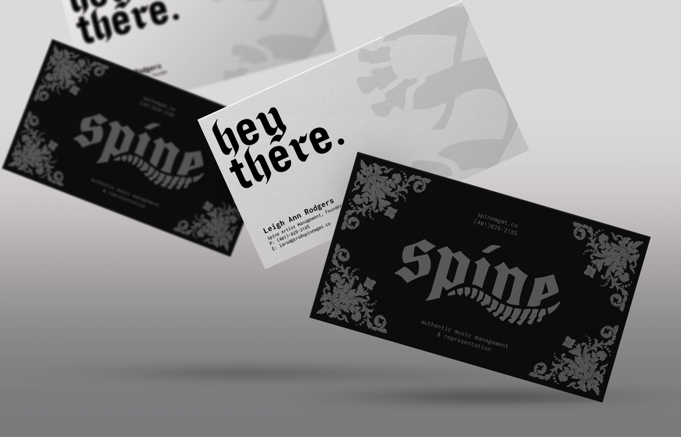
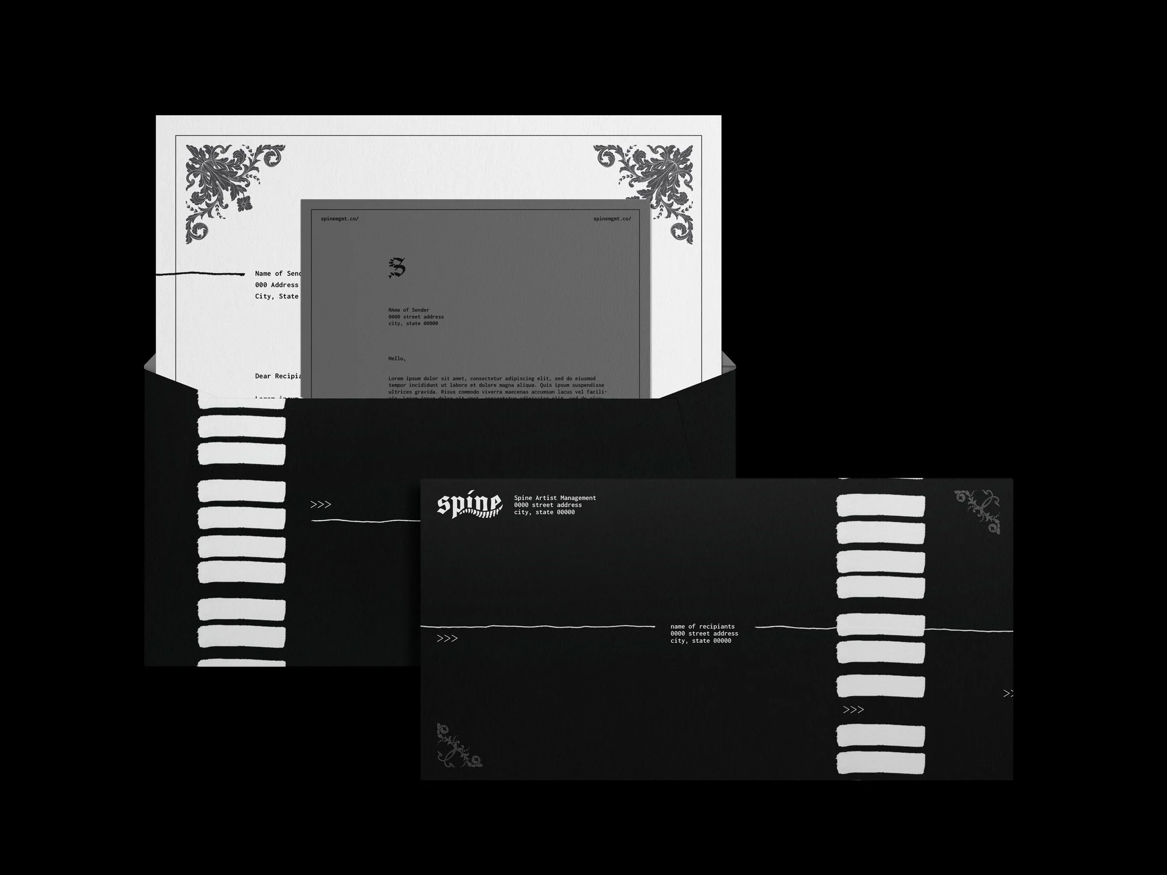
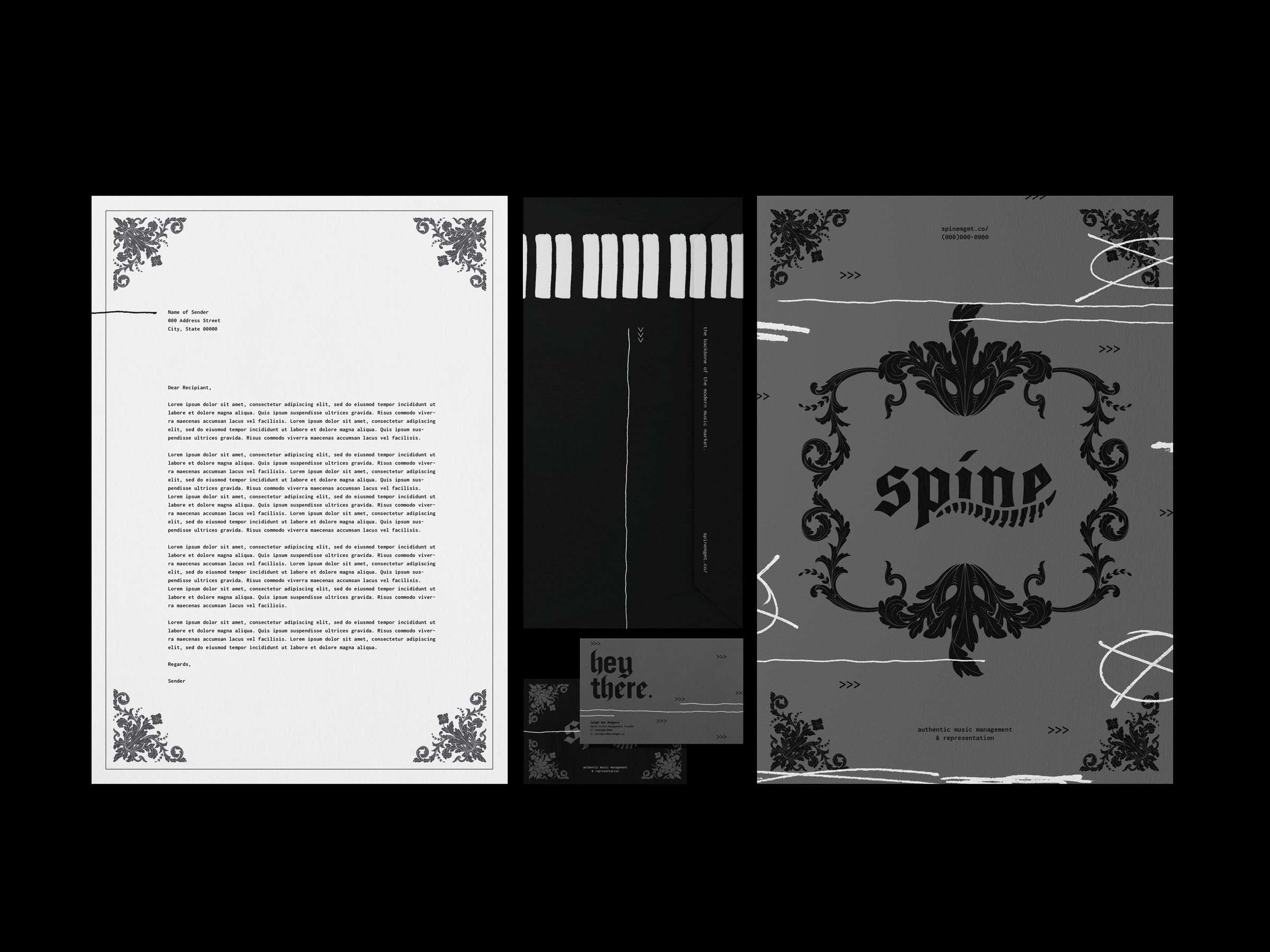
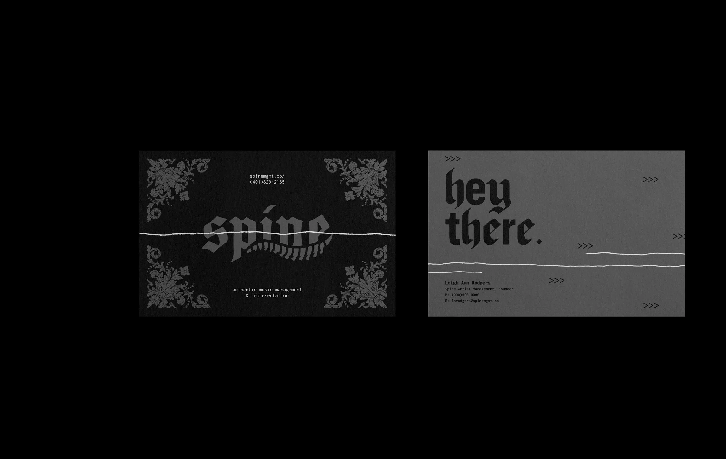
This project designed their brand identity from scratch, crafting a unique logo, developing a strong identity system, and designing some foundational deliverables such as stationery and banner ads as a guideline for them to carry into their budding business.
THE WORDMARK
The Logo
Based around their slogan “your backbone in the music industry” SPINE as a name and as a logo represents this both visually and tonally.
The Poster Series
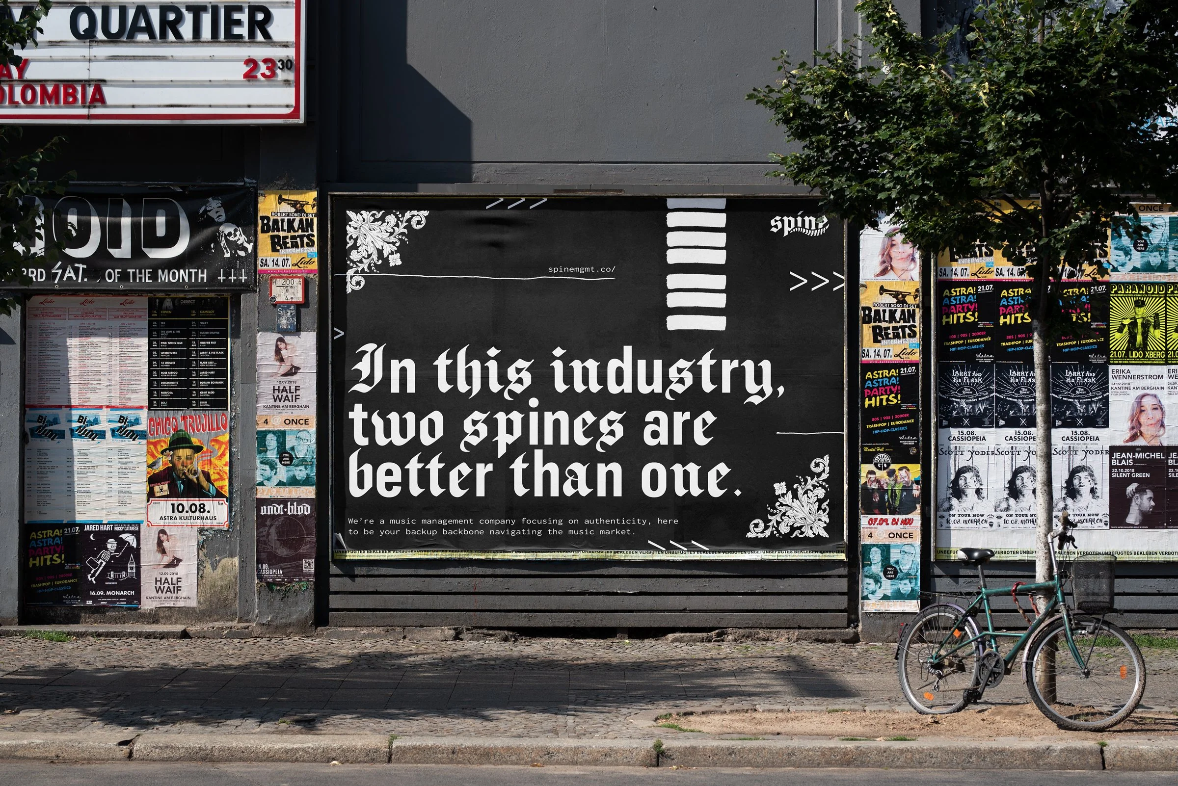
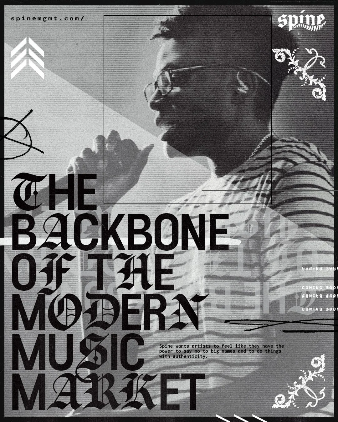
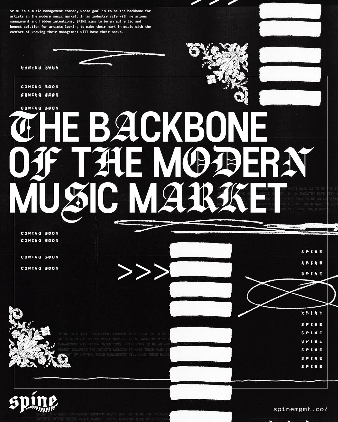
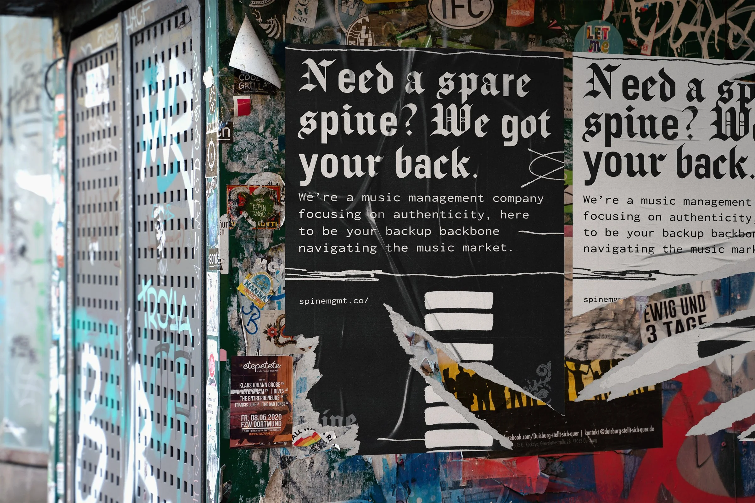
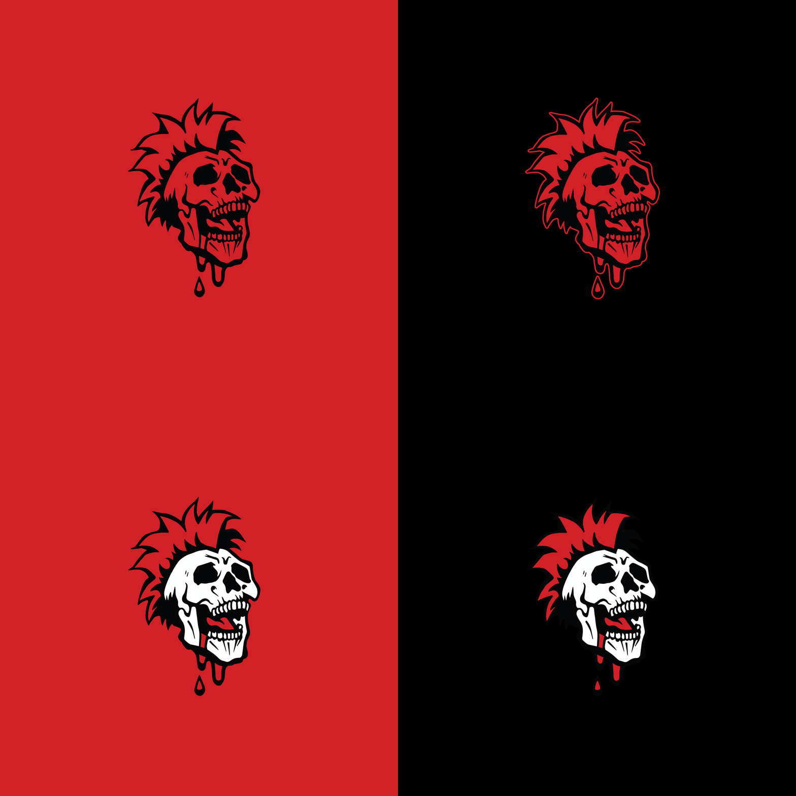
During the design and development process, we used a poster series to establish key branding assets to craft a unique and complex identity that could be used across multiple deliverables in the future.
It was important when establishing element use to create a “high end” and sleek feeling while using handcrafted and textured elements to evoke a sense of authenticity.
THE BRAND MARK
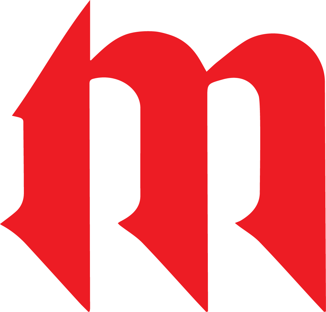
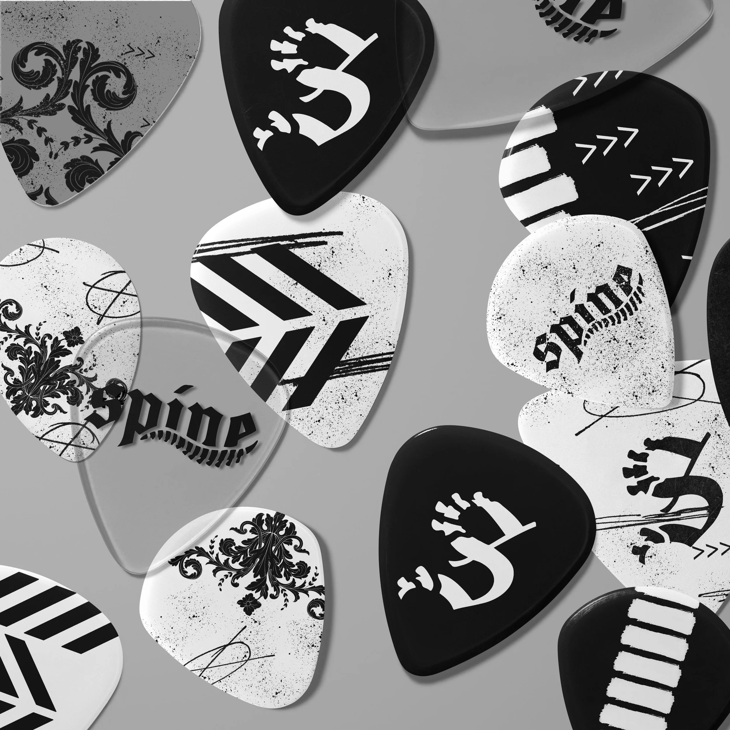
Like the full wordmark, the logo takes this visual spine concept and visually integrates it into the letterforms, crafting a unique brand mark that stands out amongst competition.
The Icon
The Brand System
Once the logo and initial brand elements were solidified, we moved into broadening the library of foundational deliverables, to tighten up the rules for how graphical elements need to be used within the system, as well as some example deliverables that the SPINE team could use as references when crafting new design materials.
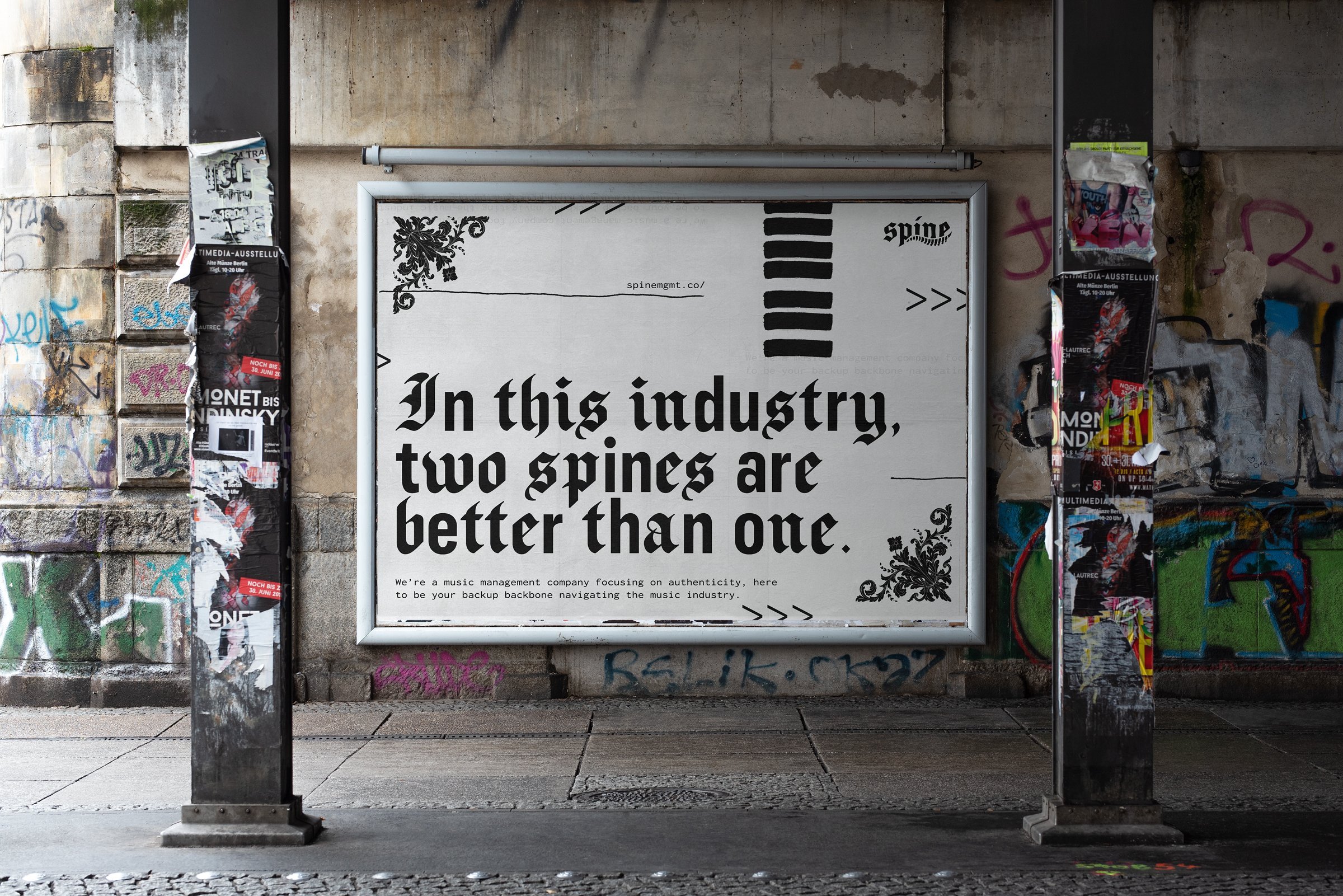
A unique element of the system, as showcased in the banner ad design is the mix of blackletter vs san serif typography. This design choice showcases the brand ethos of standing out in the music industry while also maintaining one’s own unique identity.
Banner Ad Design
It’s through design decisions like this, that the brand system emphasizes the brand messaging in a visual and tonally cohesive way.
Logo Animation
In addition to crafting the static logo designs, we also took the time to craft some animations for future digital use on social media and video content.
Apparel Concepts
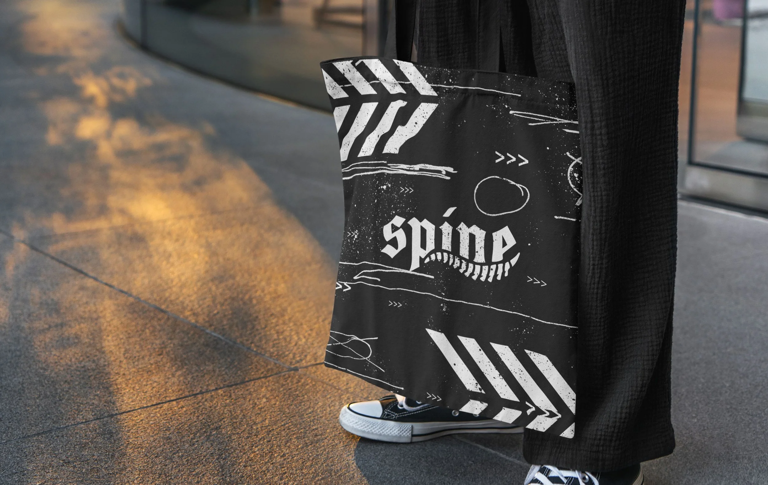
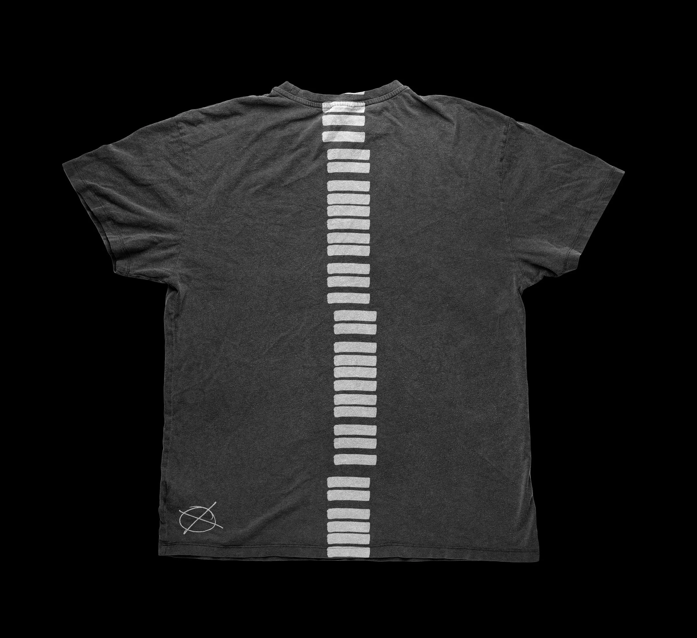
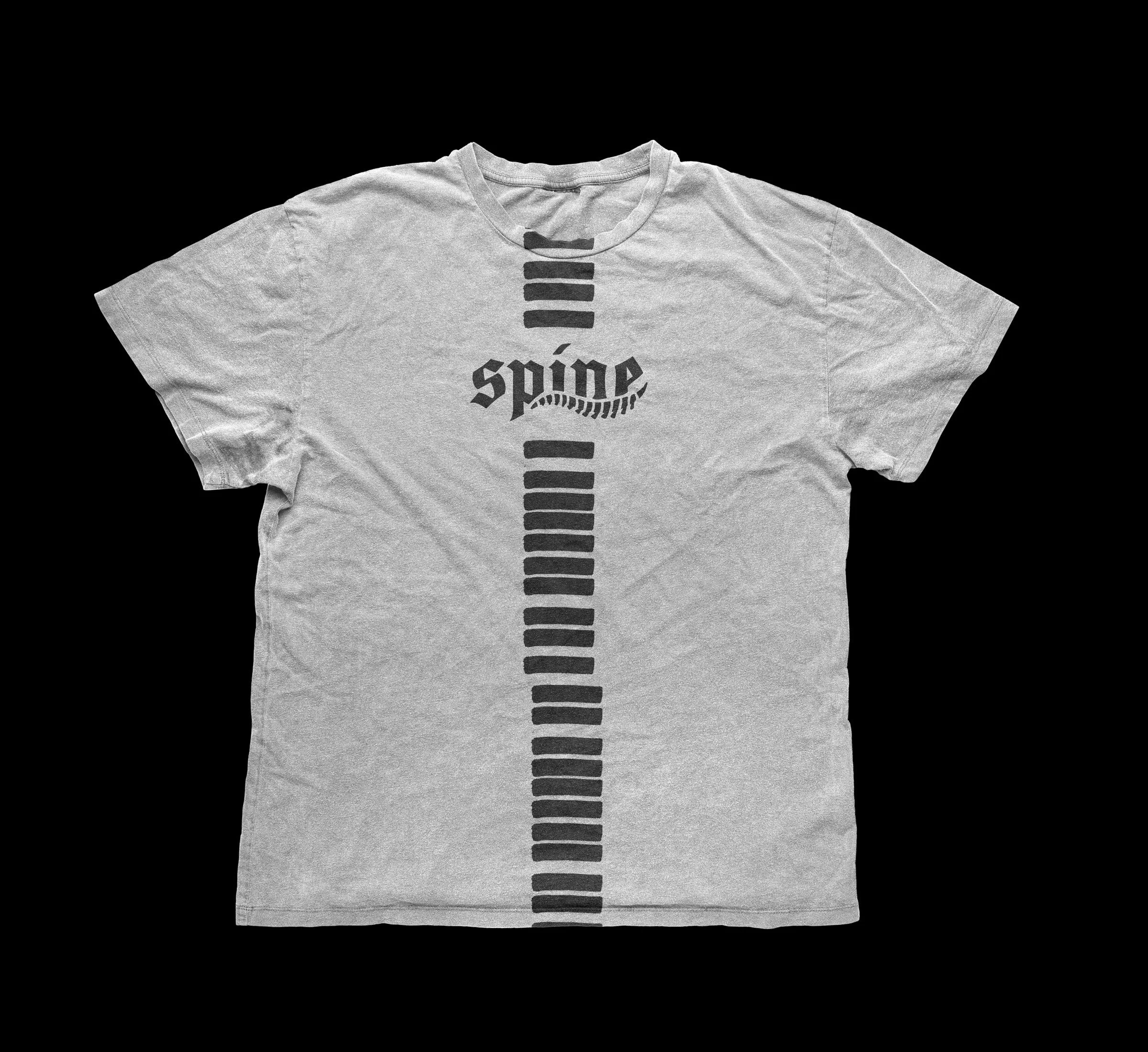
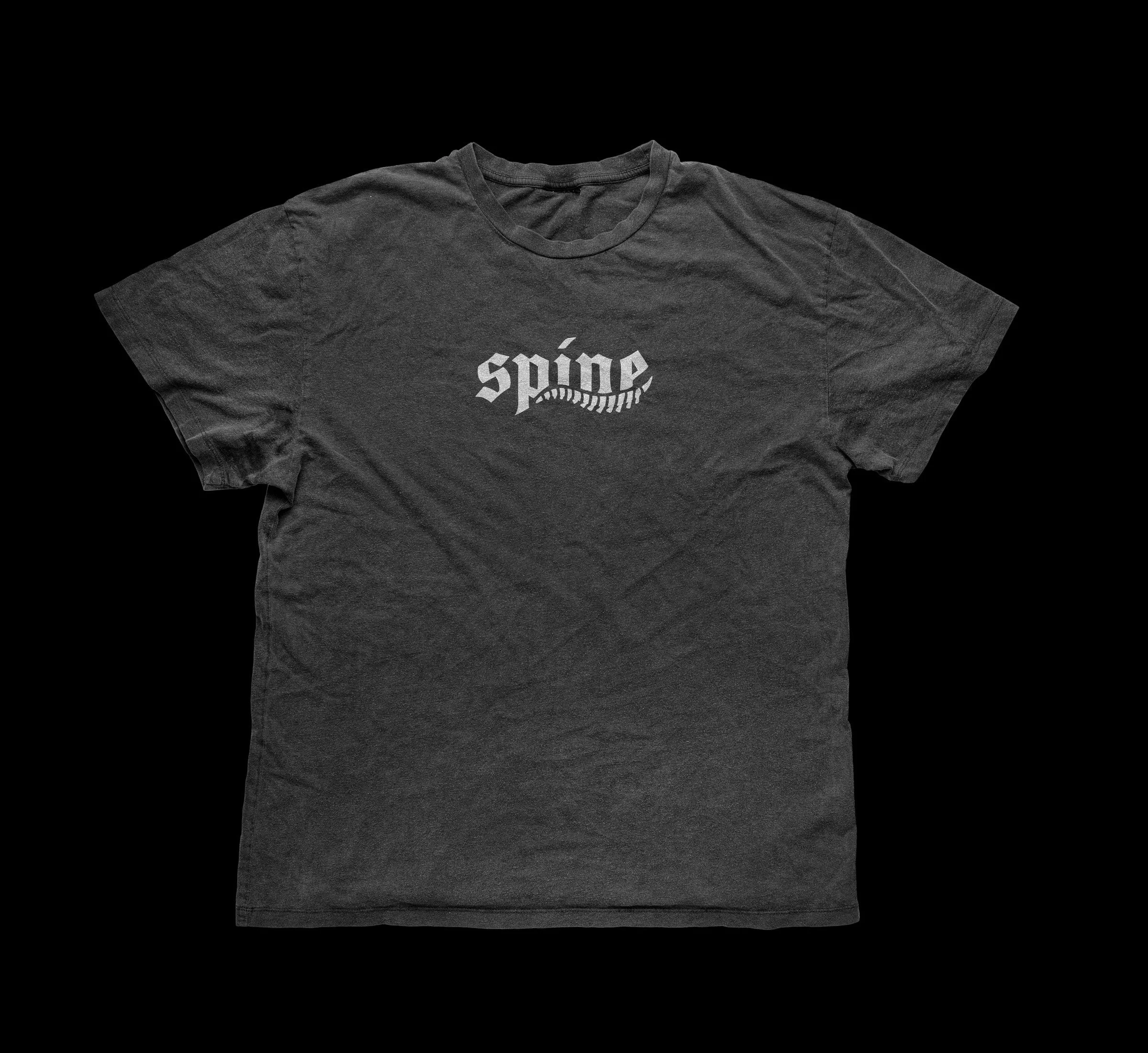
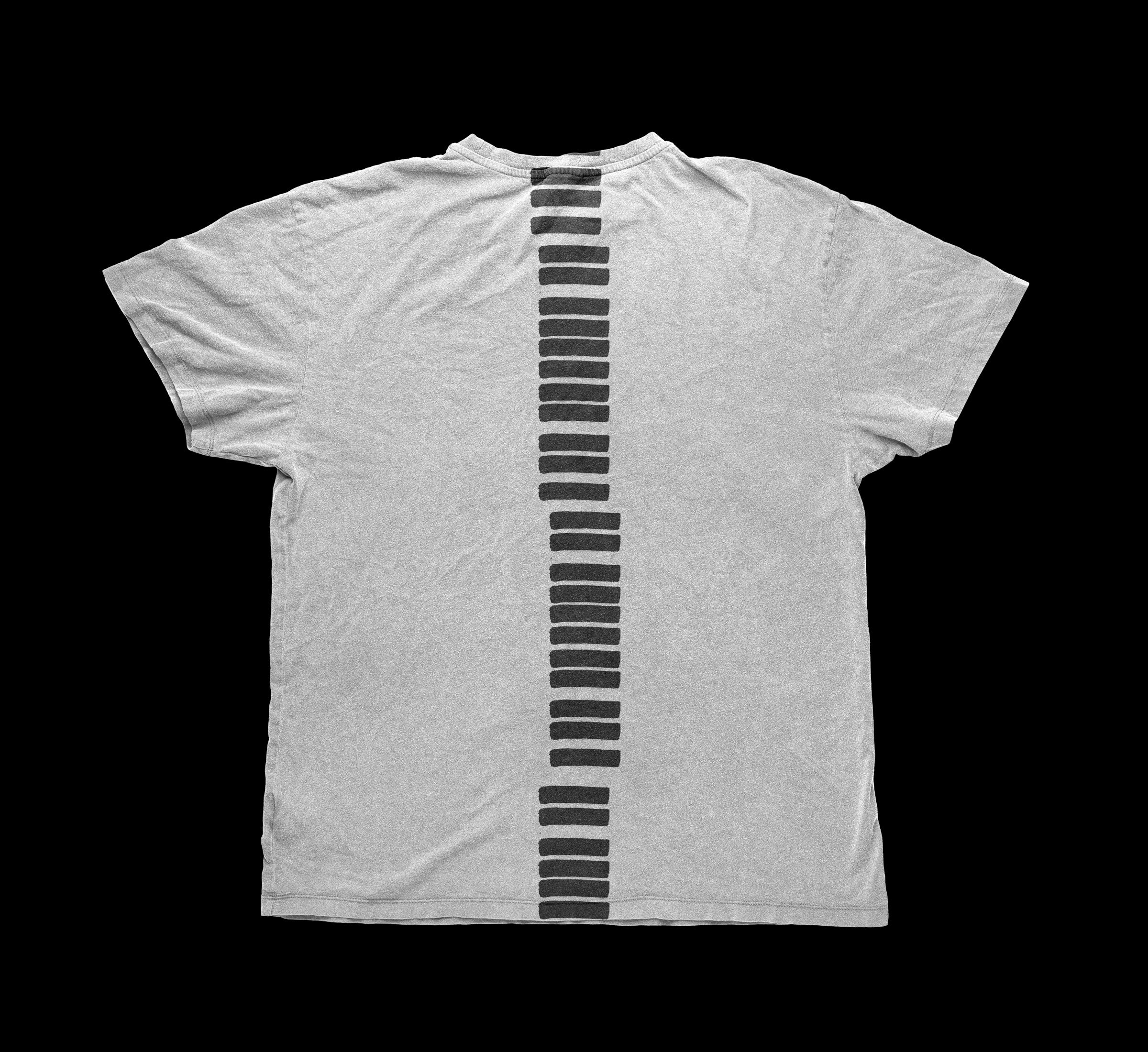
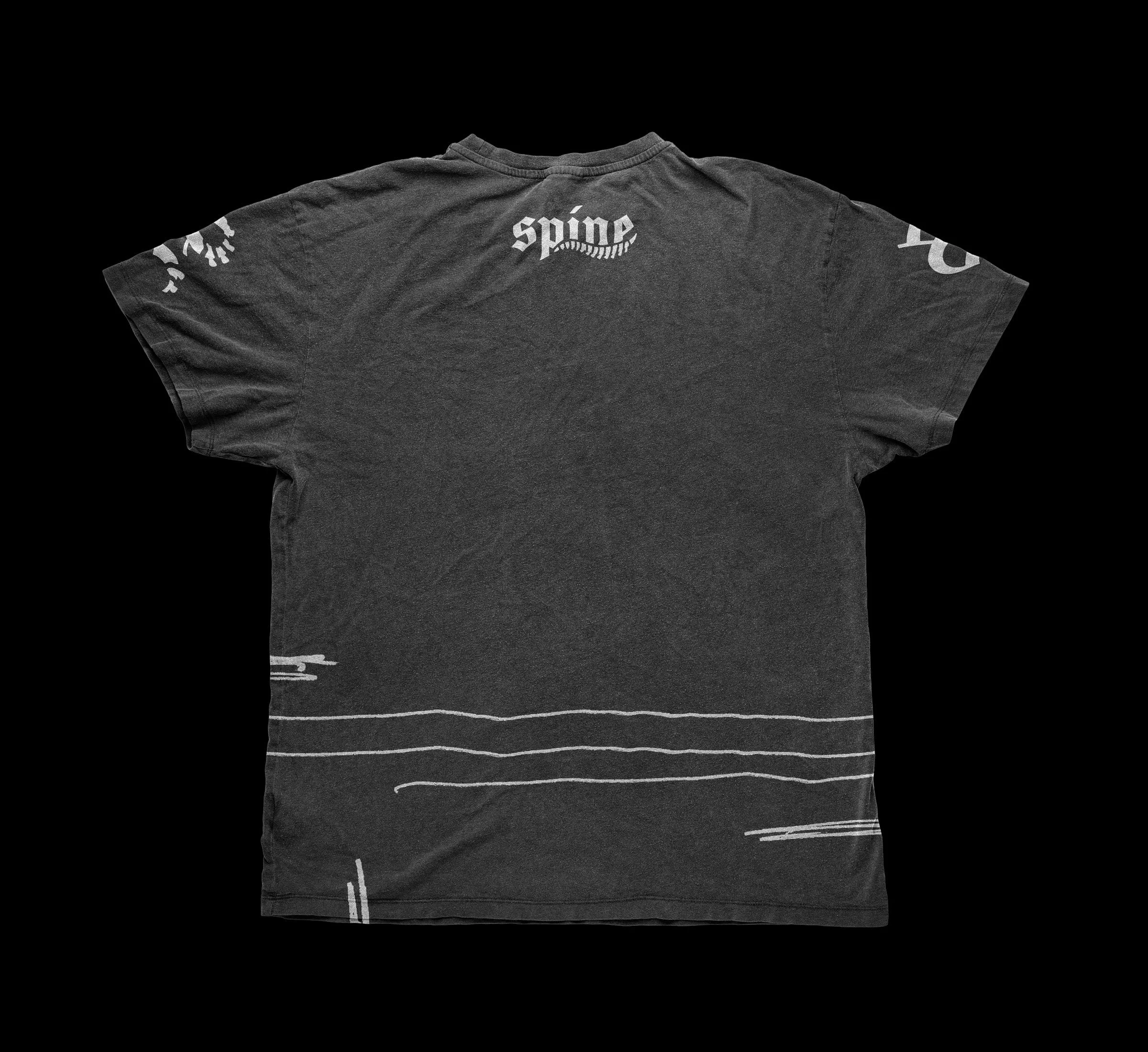
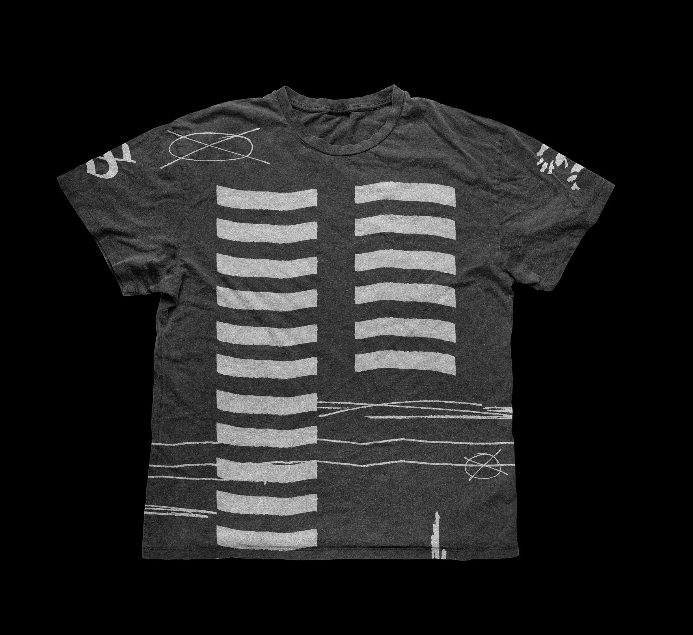
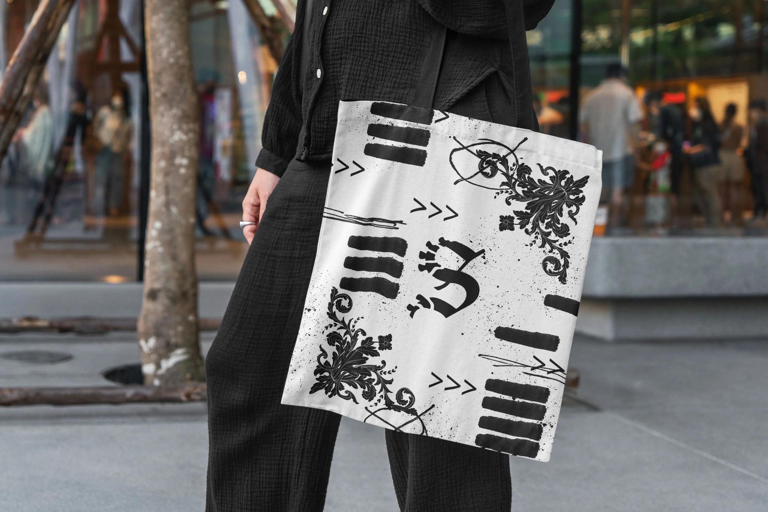
In addition to the posters and banner ads, we crafted a few conceptual merch items to showcase how the brand elements could be utilized on merch.
Here we take elements of the brand identity to create abstract spinal column and rib cage designs in conjunction with the logo and scribble elements of the system.
Overall, the system works as an effective foundation for the SPINE branding for the team to take into their future business ventures, establishing visual aesthetics, graphical elements, tone, and brand messaging that’s cohesive in values and in design.
SEE MORE WORK:
